26. Last Feature Vector and t-SNE
Last Layer
In addition to looking at the first layer(s) of a CNN, we can take the opposite approach, and look at the last linear layer in a model.
We know that the output of a classification CNN, is a fully-connected class score layer, and one layer before that is a feature vector that represents the content of the input image in some way. This feature vector is produced after an input image has gone through all the layers in the CNN, and it contains enough distinguishing information to classify the image.
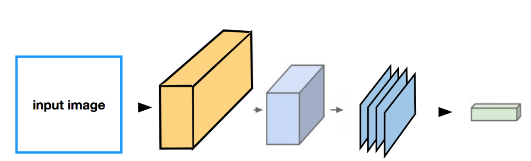
An input image going through some conv/pool layers and reaching a fully-connected layer. In between the feature maps and this fully-connected layer is a flattening step that creates a feature vector from the feature maps.
** Final Feature Vector**
So, how can we understand what’s going on in this final feature vector? What kind of information has it distilled from an image?
To visualize what a vector represents about an image, we can compare it to other feature vectors, produced by the same CNN as it sees different input images. We can run a bunch of different images through a CNN and record the last feature vector for each image. This creates a feature space, where we can compare how similar these vectors are to one another.
We can measure vector-closeness by looking at the nearest neighbors in feature space. Nearest neighbors for an image is just an image that is near to it; that matches its pixels values as closely as possible. So, an image of an orange basketball will closely match other orange basketballs or even other orange, round shapes like an orange fruit, as seen below.
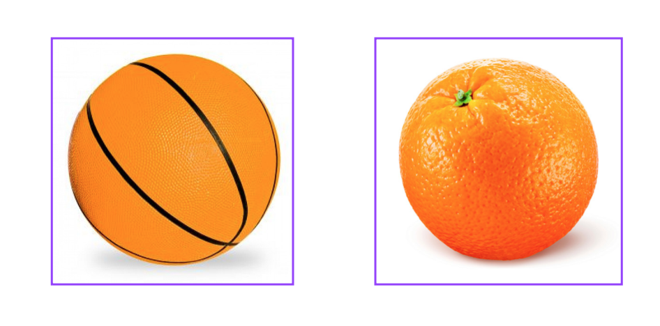
A basketball (left) and an orange (right) that are nearest neighbors in pixel space; these images have very similar colors and round shapes in the same x-y area.
Nearest neighbors in feature space
In feature space, the nearest neighbors for a given feature vector are the vectors that most closely match that one; we typically compare these with a metric like MSE or L1 distance. And these images may or may not have similar pixels, which the nearest-neighbor pixel images do; instead they have very similar content, which the feature vector has distilled.
In short, to visualize the last layer in a CNN, we ask: which feature vectors are closest to one another and which images do those correspond to?
And you can see an example of nearest neighbors in feature space, below; an image of a basketball that matches with other images of basketballs despite being a different color.
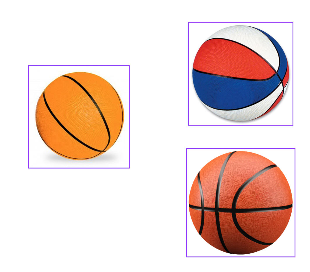
Nearest neighbors in feature space should represent the same kind of object.
Dimensionality reduction
Another method for visualizing this last layer in a CNN is to reduce the dimensionality of the final feature vector so that we can display it in 2D or 3D space.
For example, say we have a CNN that produces a 256-dimension vector (a list of 256 values). In this case, our task would be to reduce this 256-dimension vector into 2 dimensions that can then be plotted on an x-y axis. There are a few techniques that have been developed for compressing data like this.
Principal Component Analysis
One is PCA, principal component analysis, which takes a high dimensional vector and compresses it down to two dimensions. It does this by looking at the feature space and creating two variables (x, y) that are functions of these features; these two variables want to be as different as possible, which means that the produced x and y end up separating the original feature data distribution by as large a margin as possible.
t-SNE
Another really powerful method for visualization is called t-SNE (pronounced, tea-SNEE), which stands for t-distributed stochastic neighbor embeddings. It’s a non-linear dimensionality reduction that, again, aims to separate data in a way that clusters similar data close together and separates differing data.
As an example, below is a t-SNE reduction done on the MNIST dataset, which is a dataset of thousands of 28x28 images, similar to FashionMNIST, where each image is one of 10 hand-written digits 0-9.
The 28x28 pixel space of each digit is compressed to 2 dimensions by t-SNE and you can see that this produces ten clusters, one for each type of digits in the dataset!
.](img/t-sne-mnist.png)
t-SNE run on MNIST handwritten digit dataset. 10 clusters for 10 digits. You can see the generation code on Github.
t-SNE and practice with neural networks
If you are interested in learning more about neural networks, take a look at the Elective Section: Text Sentiment Analysis. Though this section is about text classification and not images or visual data, the instructor, Andrew Trask, goes through the creation of a neural network step-by-step, including setting training parameters and changing his model when he sees unexpected loss results.
He also provides an example of t-SNE visualization for the sentiment of different words, so you can actually see whether certain words are typically negative or positive, which is really interesting!
This elective section will be especially good practice for the upcoming section Advanced Computer Vision and Deep Learning, which covers RNN's for analyzing sequences of data (like sequences of text). So, if you don't want to visit this section now, you're encouraged to look at it later on.